![]()
How Colorblind People See The World
1. A lavender field in a hue of blue
 Image Source: boredpanda.com
You can see the striking difference between these two images of the same lavender field…the left image shows the vibrant purple sea of plants which someone with typical vision would see, whereas the image on the right shows how a colourblind person would see a field of blue.
2. The Powerpuff Girls dimmed down
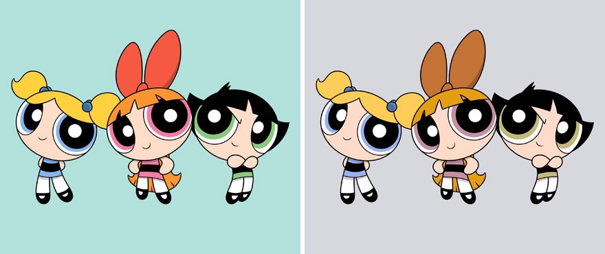 Image Source: boredpanda.com
We all recognise this iconic trio…the Powerpuff Girls! Each member has their own signature colour with Blossom wearing pink, Buttercup in green and Bubbles featuring blue. However, the image on the right shows how a colourblind person would see a much more dimmed down version.
3. This what a hamburger looks like for someone colourblind
 Image Source: boredpanda.com
Although you can still identify the different items in the burger in the image on the right, it is interesting to see how different this popular fast-food item looks for someone colourblind. The vibrant red tomato and bright green lettuce have been muted, almost looking grey in colour.
4. The different colours of the Flower Fields in The Netherlands
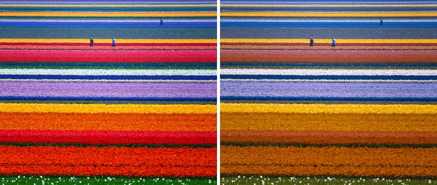 Image Source: boredpanda.com
Some of the most iconic flower fields in the world can be found in The Netherlands, which feature never-ending stretches of beautifully coloured plants in neat rows. It is amazing to see the stark difference in how a colourblind person would see these vibrant fields.
5. Mexican artist Frida Kahlo in a mellow light
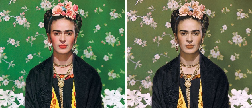 Image Source: boredpanda.com
Frida Kahlo was a Mexican artist known for her self-portraits and use of bold vibrant colours. These two images show Kahlo dressed in traditional garments with pink flowers in her hair. You can see what a difference there is in the image viewed by someone colourblind.
6. This is what parrots look like if you're colourblind
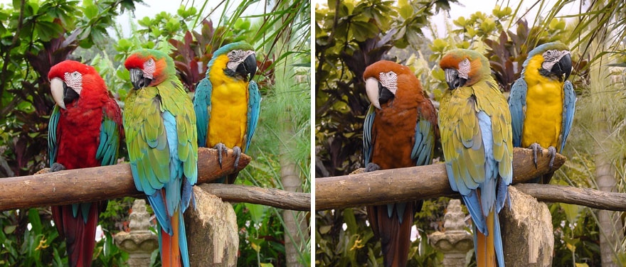 Image Source: boredpanda.com
Parrots are colourful birds found in tropical regions across the world, and there are nearly 400 different types of species! Here we can see three parrots sitting on a branch displaying their vibrant coloured feathers, although you can see how noticeably muted they are for colourblind people.
7. The muted colours of the rainbow
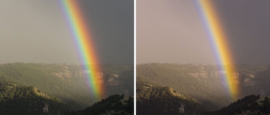 Image Source: boredpanda.com
Rainbows are stunning spectrums of light which cast a beautiful coloured arch through the sky. The colours shine bright like neon lights, which is why you can visibly see how dimmed down the rainbow looks in the image on the right for someone who is colourblind.
8. Look at the difference in the colour of Skittles!
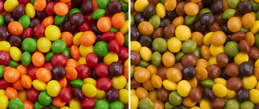 Image Source: boredpanda.com
Skittles are popular fruit-flavoured chewy sweets encased in a colourful sugar shell, as you can see in the image above on the left. It is fascinating to see how muted the colours are for people who are colourblind, which makes them look like dim shades of green and brown rather bright red and yellow.
9. Kuala Lumpur at night
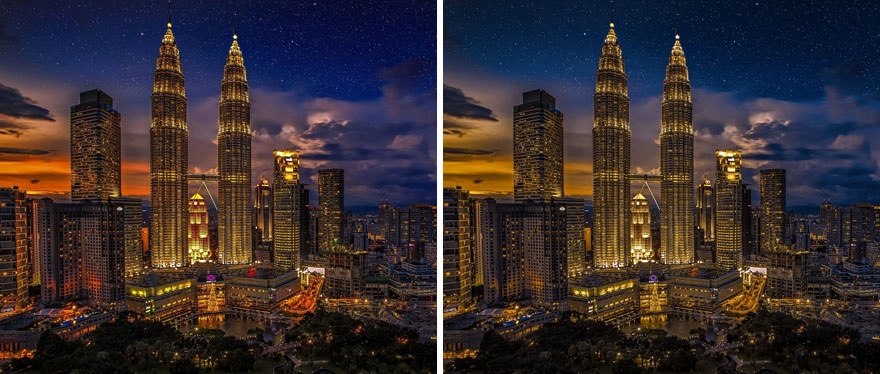 Image Source: boredpanda.com
Kuala Lumpur is the vibrant capital city of Malaysia dominated by a modern skyline with the famous Petronas Twin Towers in view. On the left shows this view for someone with typical vision, whereas the muted image on the left is how someone colourblind would see it.
10. A subdued sunset on the coast
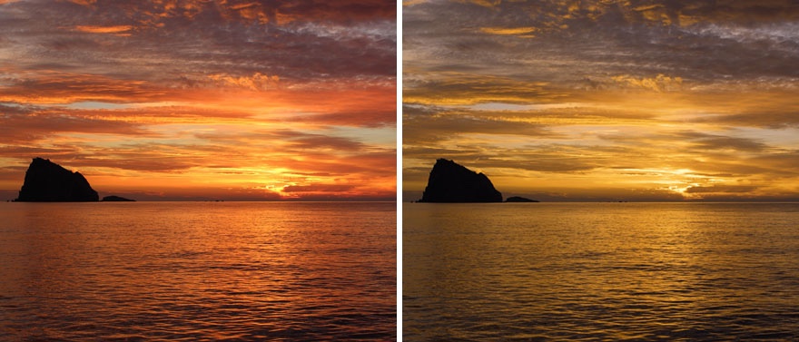 Image Source: boredpanda.com
This incredible view shows the sun setting across the ocean in Bali. The image on the left shows vibrant orange light across the sky projecting on to the water. In comparison, the image on the right shows a much more muted view with soft shades of yellow seen by someone colourblind.
11. Holi Festival of Colours...from a different perspective
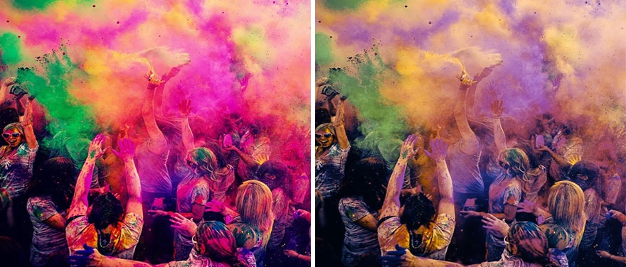 Image Source: boredpanda.com
This two-day Hindu festival originated in India. On the second day of the event coloured perfumed powder called ‘gulal’ is thrown at everyone, which you can see in the images above. For someone who is colourblind, this almost looks like a completely different image on the right.
12. Look at the difference in the colours of this autumnal scene!
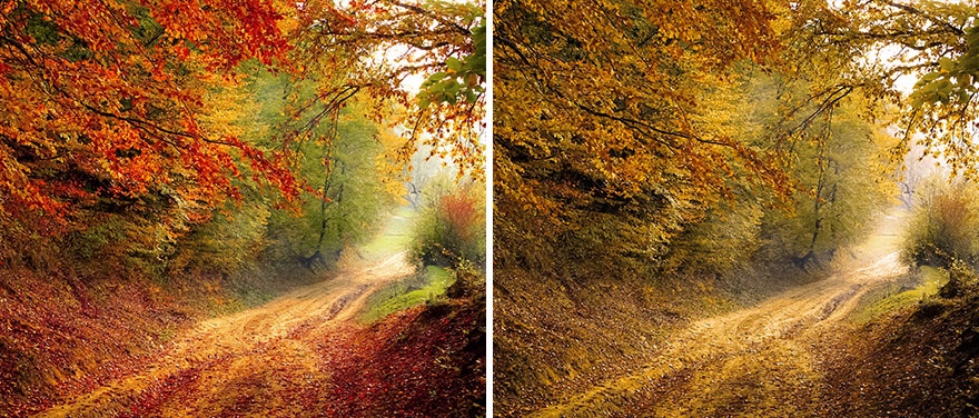 Image Source: boredpanda.com
This beautiful snapshot was taken in Germany, displaying the beautiful autumnal colours of the natural landscape as the vibrantly coloured leaves fall from the trees. You can barely see any of the bright red and orange in the right picture, which is the view of someone colourblind.
13. The vibrant colours of a Peacock muted down
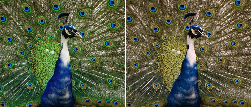 Image Source: boredpanda.com
Peacocks are one of the most elegant creatures in the world with their magnificent tail feathers which spread out into a long train during mating rituals. The feathers feature the distinctive ‘eye’ in shades of blue, red and gold. You can see how mellow these colours look for someone colourblind.
14. Viewing "Melody Of The Night" by Leonid Afremov
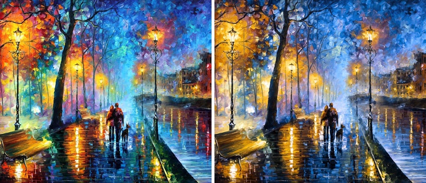 Image Source: boredpanda.com
This famous oil painting was created by Leonid Afremov who was a Russian-Israeli artist known for his skilled use of palette knives and oil paint. This iconic piece used just this method, but in the image on the right you can see how the colours of the paint have been muted.
15. A dimmed down version of The Simpsons
 Image Source: boredpanda.com
The Simpsons are a fictional cartoon family which feature in the famous American sitcom which follows their dysfunctional life in Springfield. In the picture on the left, you can see the vibrant colours of the Simpsons compared to the one on the right which is much more mellow.
16. A very mellow looking pizza
 Image Source: boredpanda.com
Who doesn’t love pizza? You can’t beat the classic Neapolitan Margherita which features tomatoes, mozzarella and fresh basil. However, as you can see in the image on the right you can hardly see the vibrant red tomato base of the pizza which almost looks brown!
17. The subdued colours of a butterfly
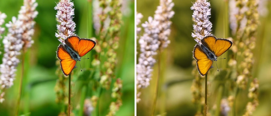 Image Source: boredpanda.com
This beautiful image of a butterfly on a flower has been captured so delicately, showing the vibrant deep orange wings in contrast to the black body. However, if you check out the image on the right you can see how muted the colours are for somebody colourblind.
18. Check out the difference in the colour of taxis in New York City
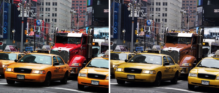 Image Source: boredpanda.com
New York is one of the most vibrant cities in the world and there is no mistaking the iconic yellow taxis dotted across the city. The deep yellow-orange colour can be seen in the image on the left for someone with typical vision, whereas they are a pastel yellow for someone colourblind.
19. A dimmed view of a valley in Lithuania
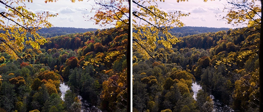 Image Source: boredpanda.com
Lithuania has so much natural beauty that nobody even knows about! Here is a snapshot of a stunning valley during the autumn months as the leaves turn from green to vibrant shades of red and orange. However, the image on the right shows a mellow dark view.
20. The colour of these tomatoes are completely muted
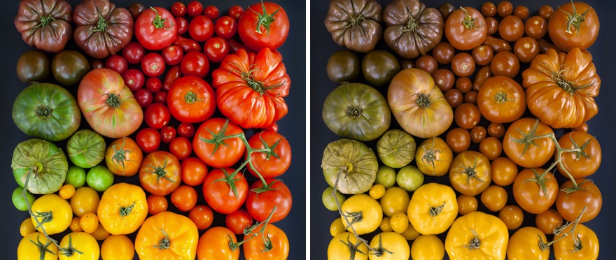 Image Source: boredpanda.com
Who knew you could get so many vibrantly coloured tomatoes! It is amazing to see the range of different shapes, colours and sizes of this popular fruit. However, if you compare the image on the left to the right you will see what a difference in colour for someone colourblind.
21. This is what "Wheatfield With Crows" by Vincent Van Gogh looks like if you're colourblind
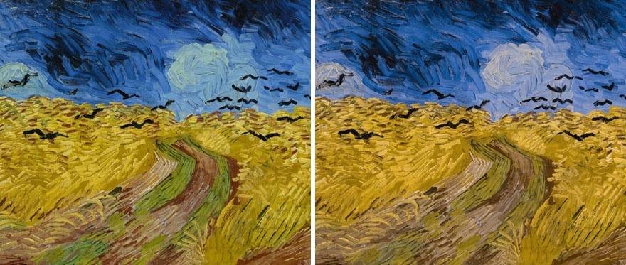 Image Source: boredpanda.com
This famous piece by Vincent Van Gogh uses a moody colour palette to create the scene of a wheat field with crows flying through. Due to the artists choice of colours, there is only a slight difference in the image for someone with typical vision compared to someone colourblind.
22. Look at the difference in the colour of these tulips!
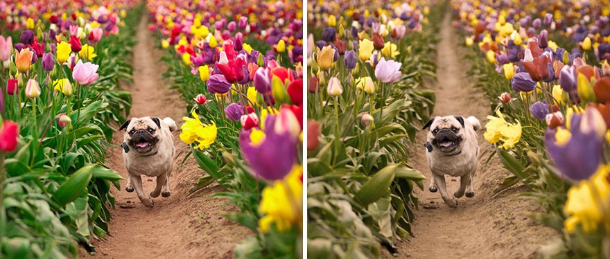 Image Source: boredpanda.com
How adorable is the snapshot of a pug running through a field of tulips? The image on the left shows how it would be viewed by someone with typical vision, showing the vibrancy of the flowers. There is a noticeable difference in the image on the right which shows a grey view.
23. The muted costume colours at the Rio De Janeiro Carnival
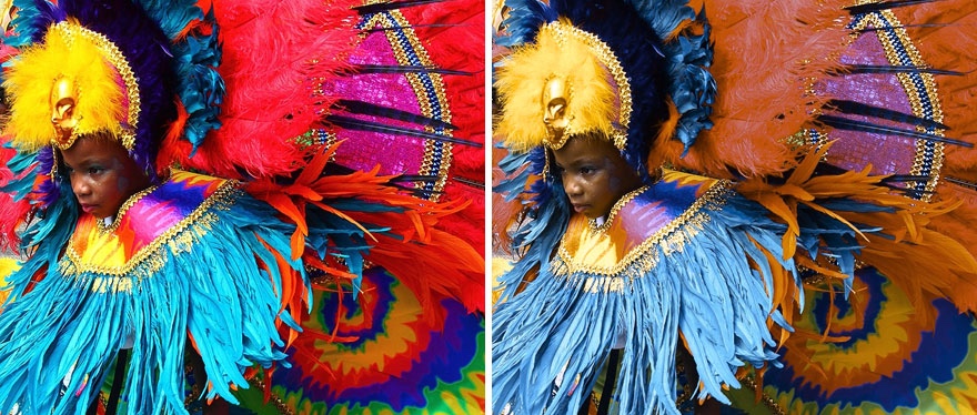 Image Source: boredpanda.com
The Rio de Janeiro Carnival is held every year just before Lent, being considered one of the biggest festivals in the world centred around sound and colour. We can see this child in an extravagant feathered costume, but look at the difference in colour in the image on the right for someone colourblind…
24. This exotic fish has lost its vibrancy
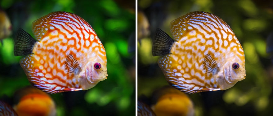 Image Source: boredpanda.com
This beautiful tropical fish is reminding us of scenes from Finding Nemo! The image on the left shows the view of someone with typical vision, highlighting the vibrancy of the coloured pattern. However, you can tell how muted this would be for someone colourblind on the right.
25. Lego blocks in a grey hue
 Image Source: boredpanda.com
Lego blocks are a popular toy choice for young children who are often drawn to their bright colours, meaning you can build different structures with coloured patterns. However, the image on the right shows how muted these coloured blocks are for someone colourblind.
26. The dimmed down colours of traffic lights
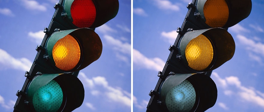 Image Source: boredpanda.com
It is important to be able to identify the colours on a traffic light as the one lit up will indicate if you can stop or go on the roads. The two images above show the difference for how traffic lights look for someone with typical vision compared to being colourblind.
27. This hummingbird is no longer glowing brightly
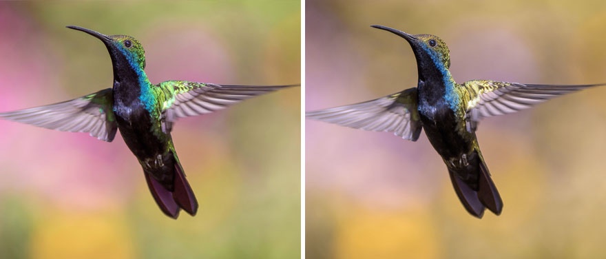 Image Source: boredpanda.com
Hummingbirds are one of the most beautiful creatures on the planet and the image on the left really highlights the vibrant glowing colours of their feathers. There is a stark difference in the image on the right, where the colours are dimmed down and almost look grey.
28. A mellow version of "Persistence Of Memory" by Salvador Dali
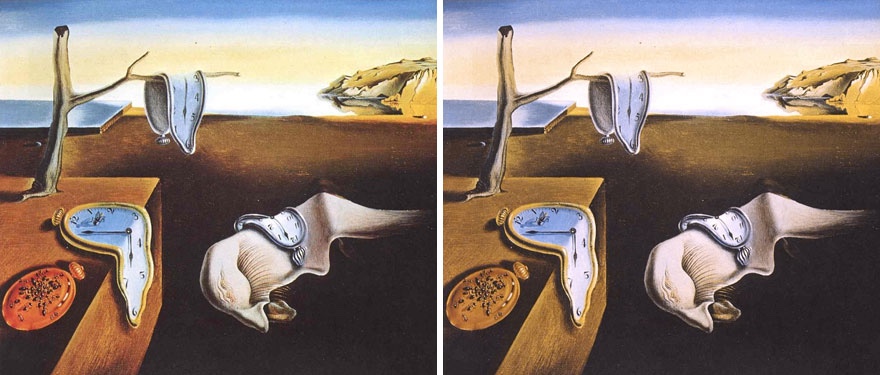 Image Source: boredpanda.com
Yet another very famous piece of art, this is "Persistence Of Memory" by Salvador Dali. In a similar fashion to the Van Gogh painting we saw above, the dark and sultry colour palette used by Dali means there is only a slight difference between the two images above.
29. This apple has gone from red to brown!
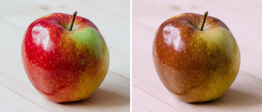 Image Source: boredpanda.com
The two images above really do highlight how different the world must look for someone colourblind compared to those with typical vision. The bright red apple in the image on the left is what we expect this fruit to look like, but it is a completely different colour on the right.
30. The muted colours of houses in Italy
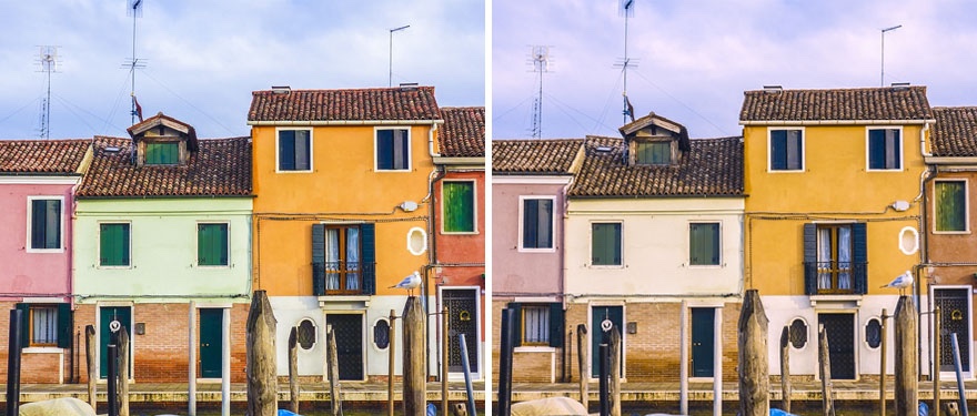 Image Source: boredpanda.com
Italy is famous for their traditional architecture which often features rows of vibrantly coloured houses like the image above. However, you can see the stark difference in the colours between the image on the left and right…you can’t even identify the green house on the right!

